

Disenfranchised #17
Preservation and Perception
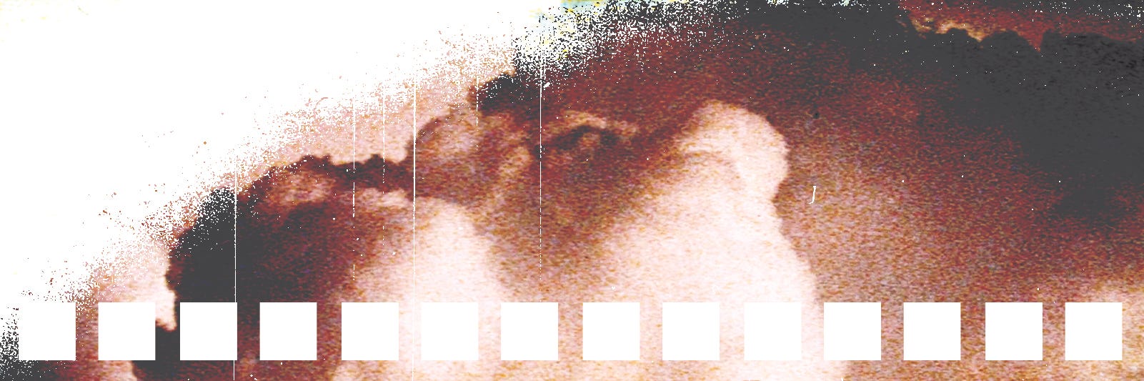
I thought it would be fun to re-watch the original Star Wars trilogy: Star Wars (1977), The Empire Strikes Back (1980), and The Return of the Jedi (1983). To complicate matters, I thought it would be fun to watch the theatrical versions. In 1997, Lucas spent ten million dollars to bring them closer to what he “originally envisioned” which involved lots of small changes, a bunch of CGI, and some new scenes. There are an overwhelming amount of options and opinions. The two most popular options seem to be The Despecialized Editions and 4K77, 4K80, and 4K83.
The Despecialized Editions were spearheaded by Petr Harmáček and are colloquially referred to as “Harmy’s Despecialized.” Harmáček bemoans Lucas’s changes as “cultural vandalism” and says, “it made me pretty angry when I realized that some of the effects shots I was admiring so much were actually re-composited digitally and thus lost much of their historical value.” In a video explaining the sources for The Despecialized Editions, Harmáček shows six versions of the opening card, blue type that says “A long time ago in a galaxy far, far away.” The point of this is to engender trust in these versions, to point out the minor tweaks that have happened with each new release or version. I pause the video and I look at the Despecialized version of the frame. The thinner strokes of the type are distorted and wonky. The letterforms are thicker where two strokes meet, like at the center of an x or the bottom of a w. The tail of the comma is pinched. All of this points to manipulation, some artificial sharpening that’s messed with the integrity of the type. The video goes on to show upscaled footage used in Harmy’s Despecialized from the rare bonus DVD in 2006 that included the original cut of Star Wars (this version is referred to as the GOUT cut: George’s original, unaltered, theatrical). The upscaled footage is flat and off—something is lost because everything is blurred, smoothed, and resharpened to fill in pixels. As the video compares footage from different sources, you can see the crop change slightly. The video goes on to show the massive digital re-compositing done to blend together all the different sources. Harmy complains about “crushed blacks, heavily altered color palette, and automated digital cleanup” in the official Star Wars releases but his versions are distorted and changed too. “It was the combination of all these source that made it possible to recreate the experience of watching Star Wars as it was originally released,” is a bold proclamation from someone who wasn’t alive when these movies were originally released.
The 4K77, 4K80, and 4K83 editions are 4K scans of original 35mm film prints that have been scanned and cleaned by a group called Team Negative 1 (TN1). There are two versions of each movie, one with a digital noise reduction filter on it and one without. Per the project’s frequently asked questions, the endeavor was done because “this is the version I grew up watching.” They’re exceptionally bright and highlights in places are clipping. There is too much saturation and contrast. The color looks really off in places, but who knows how the print was stored or how many times it was projected. While it isn’t an option for fan preservation projects, most professional restorations will scan the original of the negative if possible (not the third or fourth generation positive prints). The details of the project insist that any inconsistency is there because “it also did that in 1977.” This discounts any potential errors introduced by people who, by their own admission, are “not professional film restoration experts, they are just Star Wars fans.” It also ignores the decay inherent with 35mm film stock and the degraded image quality that happens when film is duplicated many times. 4K77 was scanned professionally but 4K80 and 4K83 were scanned on a homemade scanner. There’s not a lot of talk about restoration of the audio, possibly because none was attempted—at least in the case of 4K77, the audio is taken from the LaserDisc track.
In an essay in a Kurt Schwitters monograph, Color and Collage, Isabel Schulz shows and describes two photographs of the same collage piece, Mz 1926,5 with Violet Velvet (1926). One photo of the work was taken in 1960 and the other around 2010 when the monograph was published. The colors are astoundingly different. Everything is more muted and brown and the once saturated blue and red are washed out. The work changes just by continuing to exist. We don’t even know what the piece looked like prior to 1960—it was made thirty-six years before the photograph I’m looking at. This distorted perception of the work is potentially compounded by other factors. I’ve owned this book since it was published in 2010, and at some point it must have been on a shelf exposed to the sun—the spine has been light bleached and the tops of pages are starting to yellow. Has this already changed the color in the prints showing me the change in color? At what point in the print run were these pages printed compared to the printer proof that was maybe approved by someone for color? Could the printer have been in the middle of the job and, in a moment of not paying attention, could the cyan plate have been hit a little heavy? Did the designer of the interior throw curves and level adjustments on the images to make them pop more? Were the photos taken in 1960 and 2010 both shot with the same film camera, using the same stock, with the exact same lighting? If I could see the original work firsthand in 1926, how accurate would my memory of the color be and for how long, anyway? As Robert Altman, who often compared filmmaking to painting, said, “I don't think anybody remembers the truth, the facts. You remember impressions.” Altman was asked once if he ever revisits his old movies. He responded, “I look at them. And there's nothing I'd change in any one of them. They're finished works, reflecting a specific film experience.”
There is no perfect preservation or universal perception. Lucas has said he doesn’t want to spend the time and money restoring the original movies because “to me, it doesn’t really exist anymore.” He is not the only director who has made substantial changes for new editions. When Wong Kar Wai changed the color grading significantly for his Criterion box set, he invoked the saying “no man ever steps in the same river twice, for it’s not the same river and he’s not the same man.” Interestingly, he uses Lucas’s exact phrase saying that these new versions are closer to what he “originally envisioned” though he views the re-releases as “an opportunity to present new works.” Conversely, in a short documentary about the restoration of Wim Wenders’ movies called Restoring Time, Wenders takes a more holistic approach saying, “We never intended to make these old films look as if they’ve been shot digitally yesterday. So everything that would have shown up on the first print, we kept it.”
Some directors are changing their work intentionally but it happens just as often by mistake or carelessness. Fire up enough movies on Tubi (the people’s streaming service) and you’ll find things in the wrong aspect ratio or the rated R edited versions of NC-17 films (many of these edited versions were pushed for by studios for placement in Blockbuster who refused to carry anything rated NC-17). From any streamer, bad compression can change the appearance of color or completely obfuscate what’s happening during a dark or foggy scene. Movies are being censored for content elsewhere and not by the directors—in 2023, a new cut of The French Connection (1971) started streaming that removed Jimmy “Popeye” Doyle’s use of the n-word (a particularly puzzling decision to edit the racist language of a morally repugnant, racist character). The lauded theatrical experience is just as fraught. I’ve been to reputable indie theaters with dim projector bulbs, incorrect screen masking, or bad sound. Who knows what’s going on at commercial chains. This past December, I went to see Here (2024) and the theater started playing Heretic (2024). Preservation projects get confusing, too, especially if you don’t know what you’re looking at. I downloaded something called the “Taxi Driver Theatrical Experience” 35mm scan and it’s open matte: the aspect ratio remains at the original 3:2 it was shot in, not the widescreen it was cropped to and presented in. Whose theatrical experience was that? Certainly not one Martin Scorsese intended. Scorsese has been concerned with preservation since the 70s when he realized the new, cheaper material for negative stock was causing colors to fade within just six years—this is part of the reason he shot Raging Bull (1980) in black and white. The same year he wrote a letter about the color fading to “my friends, colleagues, and film lovers” saying, “everything we’re doing right now means absolutely nothing” and that “we must act now.”
Preservation is important but it’s hard to know what proper preservation looks like. This is true of film, art, and the natural world around us. There is no obvious answer and, in film, every time you update formats the content is going to change in some way. I end up watching 4K77 (Star Wars) and 4K83 (The Return of the Jedi). I have the most fun watching the version of The Empire Strikes Back I stumbled on. It’s labelled “Grindhouse Version” and it appears to be a straight scan of an old print with no cleanup. Lots of pops, dust, and scratches. Interested in watching more 35mm scans, I start poking around a preservation forum. I see something called “Who Framed Roger Rabbit? Uncensored.” Apparently, in an extremely brief scene in the original release of the movie, Jessica Rabbit’s dress flies away revealing her genitalia below the waist for a few frames. I find a YouTube video that slowly and painstakingly compares footage from the original to the edited release. The original clip is only three seconds long and I wonder who found this and how. I wonder why I’m watching it. I wonder who made this YouTube video and why. Definitive proof that the animators were as horned up for the big breasted cartoon lady as you always thought they were? Disney is an evil corporation but I honestly wouldn’t rank removing cartoon nudity from a children’s movie among their top offenses. I read the comments. One year ago with fourteen likes “@TheRealNormanBates” said, “It is so fast it doesn’t really matter. If you want to see Jessica Rabbit in the nude, there is always Google.” Maybe some things aren’t worth preserving.
***
Another great quote from Wenders in Restoring Time: “A film historian’s job is to reinvent the original intention or guess it. The beauty of our work now is that’s not going to be guesswork, as far as my work is concerned, and that’s a good feeling. It avoids all the conflicts you can possibly have afterwards. In the case of my films, there can’t be much conflict because I made it clear the way they should sound and look . . . as I have all the right to do that, I’m doing it.”
In a fortuitous, full circle moment, I have found a 35mm scan of Shrek (2001). Shrek was covered on the very first Disenfranchised in October 2019. You can read it here. Or don’t, the newsletter’s writing has certainly improved. I’ve been enjoying watching these 35mm scans but they all look substantially off to me, this scan has a weird yellow cast. Maybe it was there when it came out. Maybe it was there only in some low quality dupes when it came out. I don’t know—they’re not really a reliable source for what something should or did look like but can be more interesting that some of the overly smoothed and cleaned remasters out there (looking at you, AI upscaled and smoothed to hell James Cameron releases).
Thank you for reading. Disenfranchised will return.